
The second module for Computer Cartography expounds upon some of the lessons learned from the first module. These include a refresher of the essential map elements (map title, scale bar, north arrow [orientation], data source information, etc.) from Introduction to GIS (GIS 4043), and general typography principles in cartography ranging from type placement, variation dependent upon features and appropriate type size.
The concept of map clutter from module 1 was again stressed, and the underlining lesson I gained from module 2 is to keep things focused and not add unnecessary details or features. This can be hard for a cartographer, as we often have a tendency to want to use available white space and are picky about what to omit. More on that later.
Supplemental reading for the module provided quite a lot of insight when it comes to map layout and design. The textbook Cartography reaffirmed a lot of what I had learned working for map companies when it came to cartographic design. Specifically text placement, hierarchy of importance and the use of halos and masks for text resonated with me.
Delving further into the textbook, there were several principles that I had not considered so concretely before. When attempting to show the difference in labeling for features ordinally (differences between value or rank), a general guideline is that the optimal difference in height (type size) of the associated features is approximately 25%. Furthermore, avoiding a type size difference of 15% of less should be avoided.
Cartography also references that keeping the same font type for all essential map elements is ideal. It also reiterated from lecture that you should not use the word “Map” in the map title. It furthermore states that a legend should not be titled with the word “Legend” or “Key”, as this conveys the obvious. Throughout the maps I have produced for class, I never included “Legend” as the legend title, so I’ve been on the right track.
The “Type Colour” section in Cartography included a map principle I had not considered before. While text in a legend usually is decorated with black type, an option to introduce color in the type can be useful in providing a connection with the feature itself.
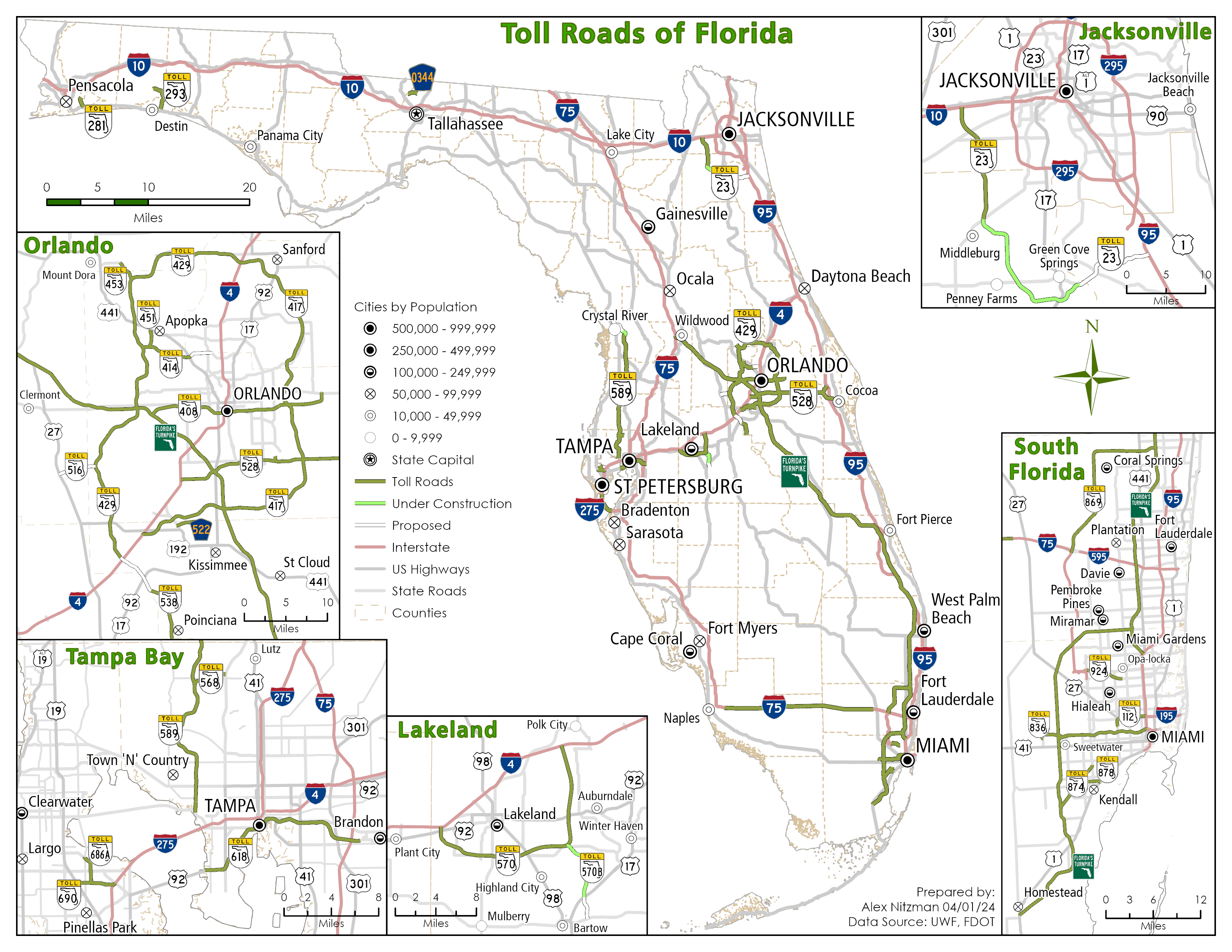
The map to be produced for this week’s lab assignment is pretty basic, showing the state of Florida with select majors cities and major rivers. The objective was to place three kinds of text: labels, Annotation and Layout text. Labeling and Layout text were commonly used in previous classes. Annotation however was introduced.
Annotation is a layer where labels are converted to graphic features. They display separately from the features in which they are associated, and can be edited, stylized and repositioned independently of the label class that generated them.
I am not stranger to working with Annotation layers, having previously both output maps for print and web sites using the feature. However, it has been quite some time since I regularly worked with Annotation layers, so my skillset needed a refresher.
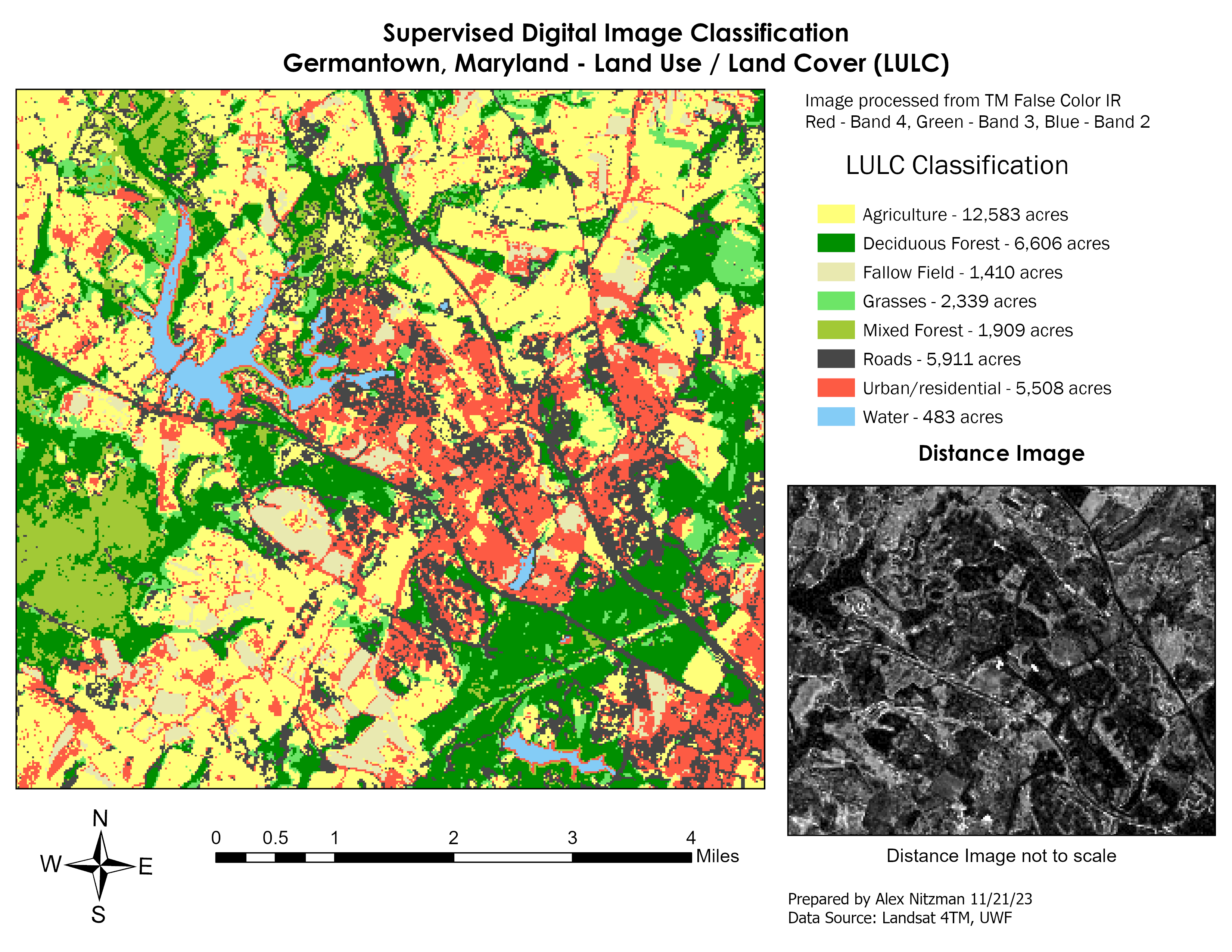
Following numerous revisions as I continued to read the textbook, the finalized map:
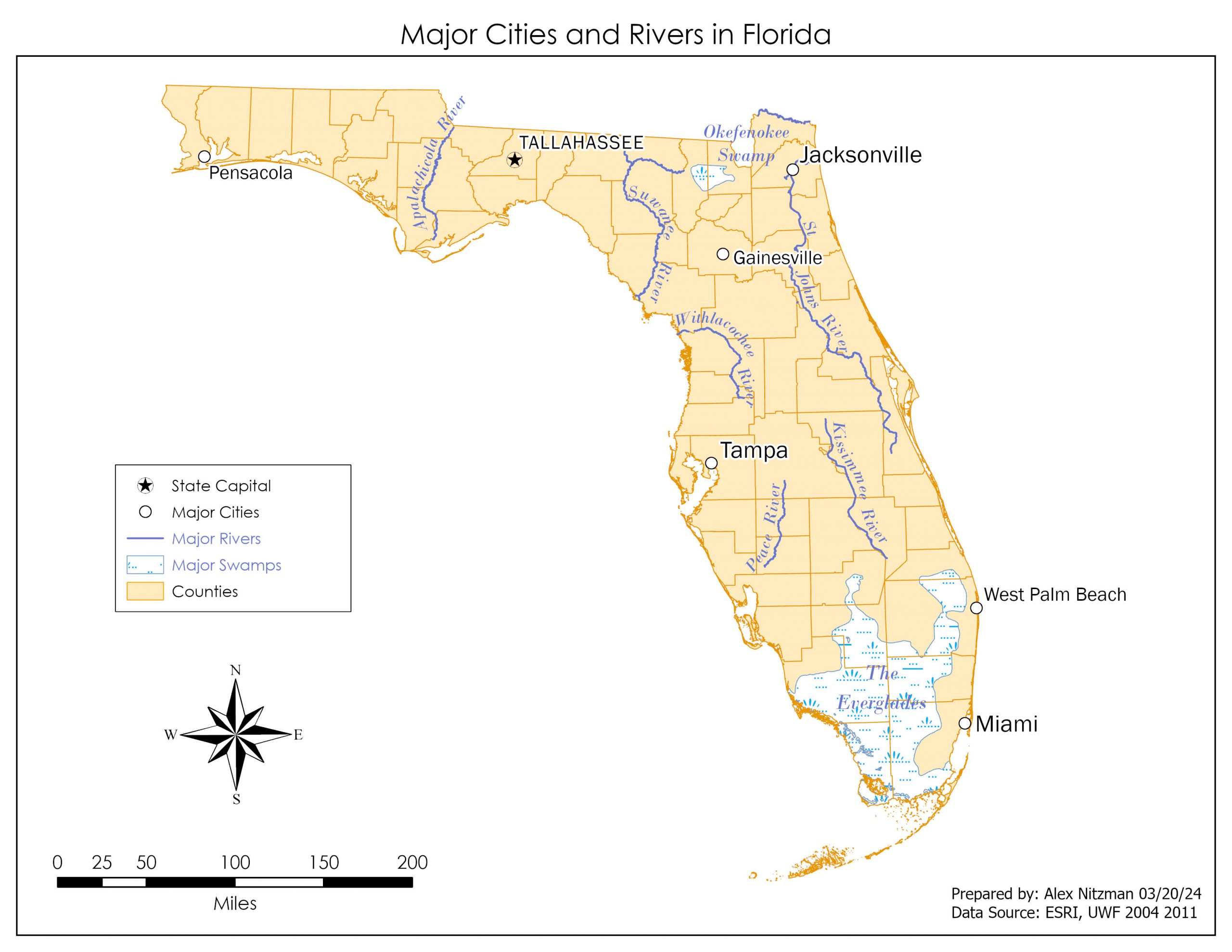
But all that white space! As a cartographer there were times where I was tempted to add a point for Orlando. I also sought to instill a transportation theme, and had actually colored coded the counties by Florida Department of Transportation (FDOT) districts by adding a column to the counties attribute table. There were other map additions that I nearly started, but then rereading the lab instructions and focusing on the British Cartographic Society’s Design Group principle “Concept before compilation,” where “Think about what the map needs to contain, how it should look, and who is going to read it,” I thought better of it. Furthermore we were to make three customizations to the map, not make additions!

Leave A Comment