Advancing to our second week of Computer Cartography, the first module requires us to think about how we look at and interpret a map. Our task was to select for critical analysis and evaluation, both a map that we consider well designed, and another that is poorly designed.
What a task that was, as there have been several over the years that fit both contexts. Trying to recall any that stood out proved to be challenging, because as the saying goes “out of sight, out of mind.” Fortunately I have a growing repository of map documents that I use for researching page creation and updates for AARoads. Sifting through the various folders, I found two that fit the criteria.

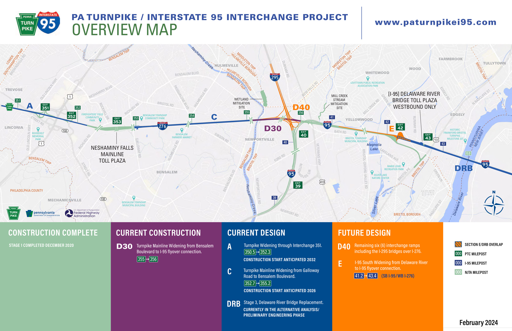
The well designed map selected is the most recent Overview Map of the ongoing PA Turnpike/I-95 Interchange Project in Bucks County, Pennsylvania. Within lecture, we were introduced to the map design principles of the British Cartographic Society’s Design Group. One that stood out for me is “Simplicity from Sacrifice” where great design tends toward simplicity or more simply “less is more.”
The PA Turnpike/I-95 project map colorizes only the affected roads within the project area. Having a full color map of the entire area is not necessary in this context, so reducing the detail and keeping the design focused solely on the subject is appropriate for this type of map. The map audience can clearly view the project and the simple color scheme conveys what is currently under construction, and what to expect in the future.
Many of the maps I have been tasked with creating or updating were all-inclusive. Street atlases for Mapsource, Wall Maps for Universal Map Group, products that included an array of points of interest, every public road, detailed hydrology features, etc. Designing a map with less correlated to producing an incomplete product or omitting features out of laziness. This philosophy was engrained into my cartographic style and I did not question it until this module…
The second principle of the British Cartographic Society’s Design Group discussed in lecture is “Hierarchy with Harmony.” The concept is to emphasize what is important on a map, to reduce the less important and remove the unimportant. The PA Turnpike/I-95 project map conveys only the necessary information, with a substantial amount of street level detail reduced in prominence. Not all roads were deemphasized to the same level, as intersecting highways to the project area were made to stand out somewhat against the rest of the area.
So less is more works out well in this context. Viewers do not need to see unaffected roads and areas with the same level of detail or colors as the map’s primary focus. Yet keeping some of the detail in the background still conveys the population density of the area, showing that the project will have impacts to the nearby communities.

This Salt Lake City Community Councils and Neighborhoods Map immediately stood out as a poorly designed map candidate. It nearly looks like raw, unstylized GIS data, yet some effort was placed in the layout and output to consider it fit for use by the public.
The first map design principle of the British Cartographic Society’s Design Group is “Concept before compilation.” This stresses that it is important to understand the concept of your map entirely. What does the map need to contain, how should it look, who is the intended audience and what will they want or get from the map?
I originally downloaded this map of Salt Lake City to learn what were the neighborhoods in the city and what were their general boundaries. The map conveys this, but not in an efficient or appealing manor. The amount of black linework from the street rights of way overwhelms the map, making it hard to parse neighborhoods from community council districts. The background results in just noise, and without any emphasis on major streets or legible street names, another map has to be consulted to formally locate a neighborhood within the street grid.
The thick neighborhood polygons dominate the feel of this map. Lost within their bounds is the small red italicized text referencing the neighborhood names. The way it is presented, the neighborhoods and community councils appear synonymous with one another, but that is not apparent until analyzing an area of the map with less detail. Clearly this map does not adhere to the Hierachy with Harmony map design principle.
It is arguable what may be more important in this Salt Lake City map, neighborhood boundaries or community council areas? Without any descriptive text somewhere on the map telling the audience what the community councils are, or what is their purpose, their significance is unclear. Is the label size appropriate for those councils? This map conveys that they are important, yet the boundaries of the neighborhoods hold just as much weight in their line thickness. So the hierarchy is not readily known for the end map user, another poor design aspect of this map.
Another topic stressed in this week’s module are map elements (title, legend north arrow, scale bar, etc.) and more specifically the placement of them. Utilizing areas of white space for elements is one thing, but also leaving room for them in the map layout is another. All the while balancing map elements with the overall composition of the map is important. An aesthetically pleasing layout goes a long way.


Leave A Comment